THEORY COFFEE
Team: Sadie Clyne
Research, Ideations, Design, Prototyping & Testing: Sadie Clyne
Tools Used: Figma, FigJam, Google Suite
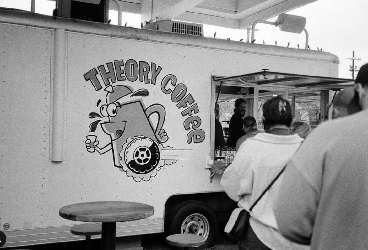
A responsive web redesign of Theory Coffee Company, a coffee trailer and mobile coffee truck based in San Antonio, Texas.
-
Theory’s current website was difficult to navigate and did not accurately portray the community that they created. This project was completed without any materials provided from the owner - all copy and images are from their existing website and their Instagram page. Their point-of-sale (POS) system is Square, which does not collaborate with Squarespace, their website hosting platform - meaning users will ultimately be redirected to Square to place an order.
This was the first real-world project where all aspects were completed by me alone. It was laborious but ultimately, a fantastic experience where I learned how to manage my time and what it means to freelance alone.
-
Theory is a company that has established a loyal customer base and continues to be a pillar in the community for coffee-lovers. Using their existing colors and images that are on the trailer, this new redesign conveys their personality as a whole. It was imperative to design a site where a user could order coffee to-go without unnecessary clicks.


The Problem
Theory Coffee is a trailer that was converted into a mobile coffee spot in San Antonio. Their current platform does not allow for easy ordering and does not accurately represent their identity as a company. Ordering online was a process that took the user in unnecessary directions and created confusion.
The solution
From a business perspective, it became apparent that their website was more of a hindrance than it was something useful. I redesigned the website for both desktop and mobile so that customers are able to order online easily as well as learn more about the company and the community they have created for San Antonio.
Research
The current website was not representative of the company as a whole, and was difficult to navigate. Each page has the logo front and center, and it is the only thing on the landing page. The formatting is also not responsive, and on desktop, the text on the ‘About’ page is all right hand centered. There was no use of color or visually-interesting fonts which could have conveyed Theory’s personality.
When ordering, it directs the user to a bright orange page, they have to click ‘Order Here’ again, and then once more when they are directed to Square. What should be a 1-click navigation is currently 3.
In comparison to other coffee shops and food truck vendors in the area, Theory was lacking an online presence, aside from their Instagram. It is evident through in-person interactions with their team that one of their main pillars is community, but anybody who hasn’t been before or doesn’t live in the area would have no idea based on what they see online.


ideation
During the design process, I kept 5 keywords in mind:
ENERGETIC, FRIENDLY, RETRO, UNIQUE, & FUN
The personality of Theory Coffee is spunky and quirky, and these traits are expressed through their bright colors, interesting display fonts, and images of their business.


persona
The avid coffee drinker, on the go during the week and relaxing on the weekends, but still frequenting the same coffee shop.
They wish there was a more direct route to order online, and they wish that the website was more updated to effectively represent the business.
This coffee fanatic was kept in mind throughout this project.
SKETCHES

Based on what was missing from the original website, I knew the following were non-negotiable to include:
Implement a home page with connections to the rest of the site
Highlight Mark as the owner - add an image of him on the ‘About’ page
Add images of the business and the community they’ve created
Have ‘Order Online’ accessible from every page
The first sketches included some ideas for a marketplace where products such as coffee beans and merch could be purchased, but the current Theory business does not have a shop implemented. In the future, these product pages could be designed.
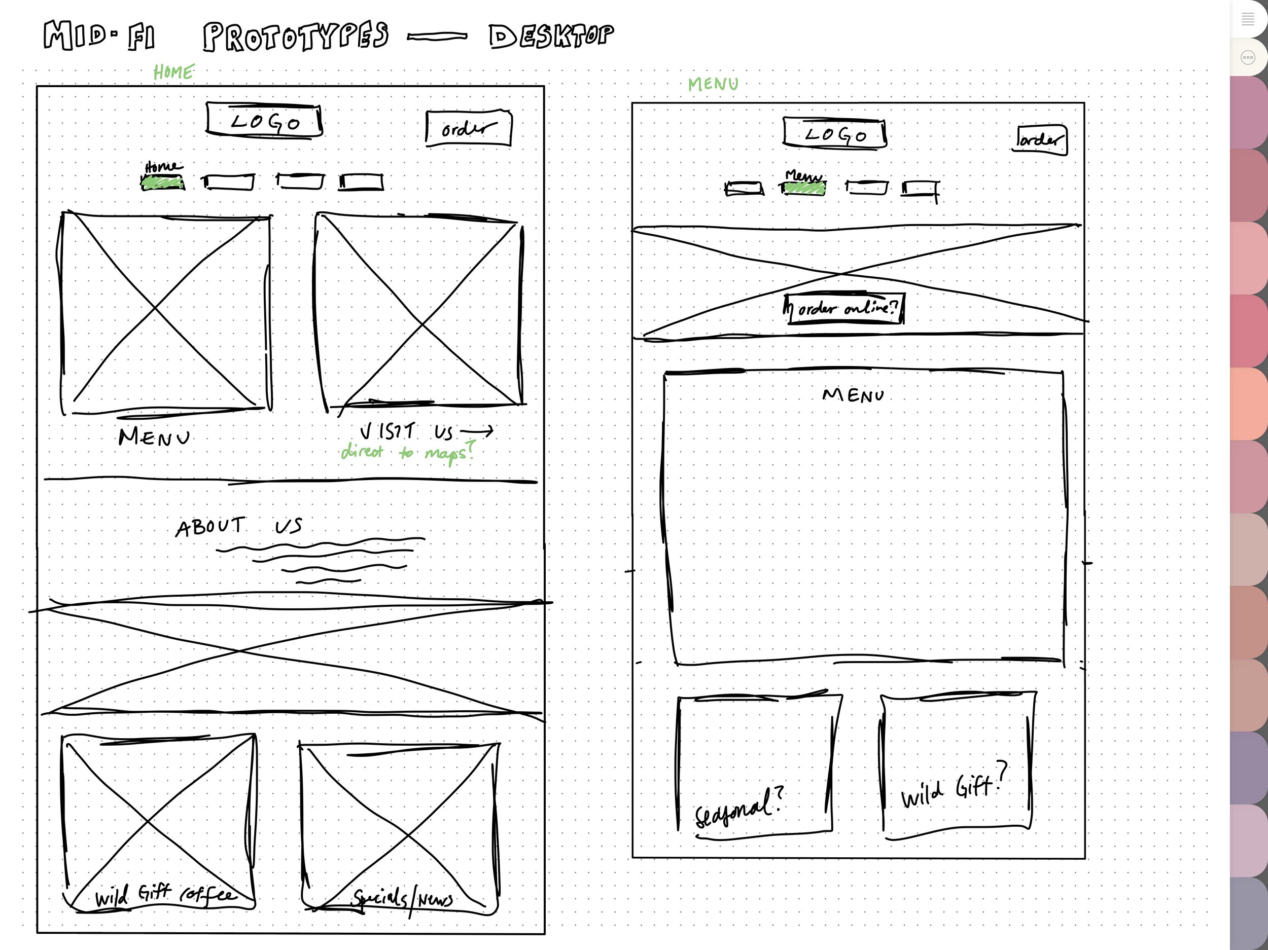
MID-FI


The mid-fi designs were kept in grayscale in an effort to focus on the layout and functions of the site. It was important to create an overlay menu for the mobile design, so the rest of the site is accessible. I also kept the previously mentioned non-negotiables in mind.
FINAL PROTOTYPE

Final thoughts
On the original website, there is not a comprehensive, direct way to place orders online, and the inviting personality of Theory was not represented well. Updating the website to contain current information and images would be crucial in the continuation of this project. Theory, as a company and a brand, is growing and needs their platforms to grow at the same rate.
For future iterations, the current point-of-sale system would be reconsidered since it does not blend well with their current hosting platform and requires the user to jump to a third party website.