THE IOU FOUNDATION
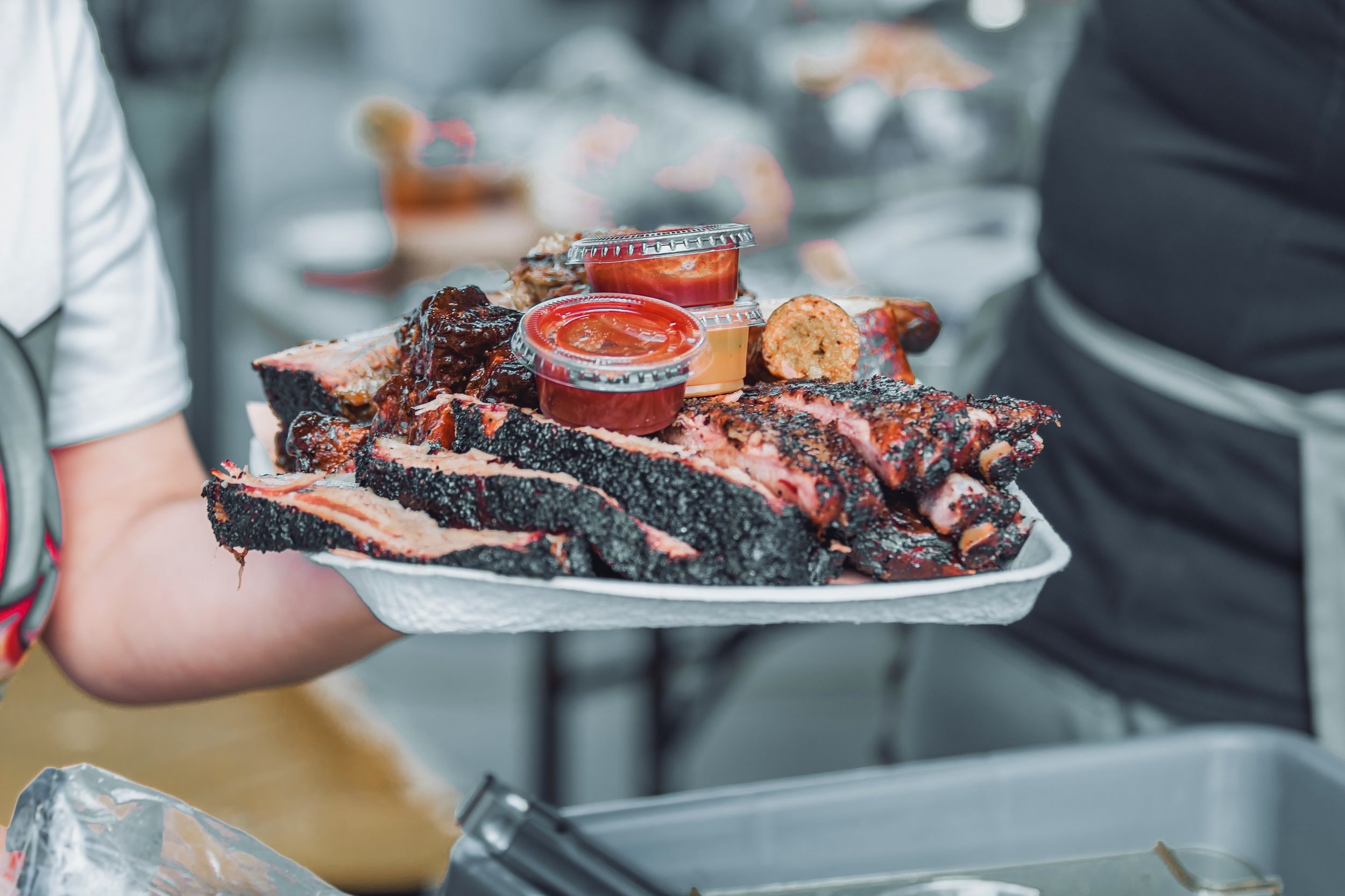
A responsive web redesign of The IOU Foundation, a 501(c)(3) non-profit based in Austin, Texas. They fundraise through BBQs and donations, and give back to many charities across the United States.
Team: Sadie Clyne, Annie Bond, Kaitlyn Campbell, Alyssa Soto, Joe Sargeant, Adrianna Lopez
Research, Ideation, Design, Copywriting, Prototyping & Testing: all team members
Tools Used: Figma, Figjam, Google Suite, Slack, Trello, Otter.ai
-
The existing website for this non-profit was confusing, undefined, and inaccessible, and the current website does not accurately convey the values of the IOU Foundation. During the design process, we wanted to consult with the stakeholders but we were unable to get in contact with them.
-
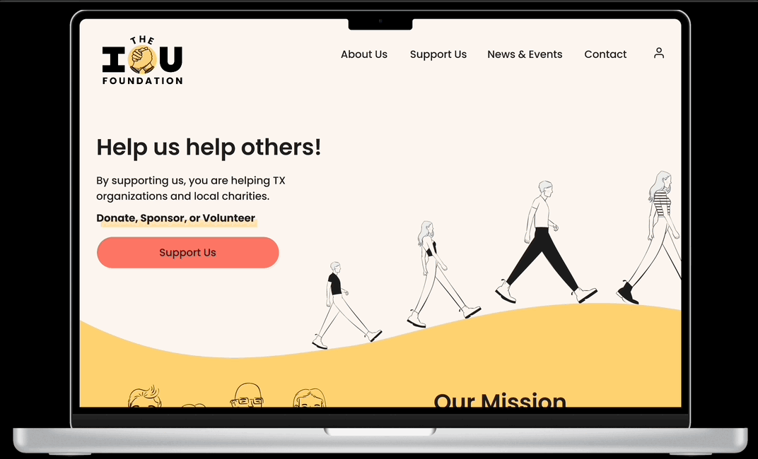
For a non-profit that is based on community and altruism, we wanted their site to reflect this through trustworthy design. Using mainly primary colors and sans serif fonts, we implemented a visual way for the non-profit to express its mission in a friendly and simple way. With prototypes designed to be responsive, any user from any device could access this website.
The Problem
The IOU Foundation is an altruistic charity that does not have the platform to effectively bring in donations. Their current site is hard to navigate, has links that takes the user to a completely different site, and is not designed to convey trust and legitimacy. To be frank, volunteers and those wanting to donate lack confidence in knowing where they are putting their money.
The solution
From the beginning of our research, our team was able to glean one simple fact: all charities are important and every cause they stand for is valuable. Users needed to be able to understand the IOU Foundation’s principles, and recognize the importance of this charity. In order to foster donations and create a positive impact towards the community, it was necessary to design smooth navigation and prioritize the user’s trust.
As seen from rounds of user testing, with each iteration came increases in the success of task completion. Essentially, our goals of producing an informative, streamlined experience succeeded. This redesign allows sponsors, volunteers and people who donate to understand where their resources are going and be able to interact with the IOU Foundation in a trustworthy, verified way.

Research
The original website was cluttered, visually distracting, and not responsive. Results gathered from user testing revealed that it was difficult to navigate and impossible to find upcoming fundraising events. When looking at competitors like DonorBox or Universal Giving, my team and I understood that one of the main things users want to feel when donating their money is trust. These other organizations have easy paths to donate without excessive searching, while IOU has the user take a convoluted route.
50% of users could not identify the mission of the iou foundation
We asked 12 users to complete 4 tasks:
Find the mission statement.
Find where to donate.
Find upcoming fundraising events.
Find where to become a sponsor.
After the preliminary user tests of the original website, we created an affinity diagram and an empathy map and concentrated on the most notable comments.
“This looks like a scam.”
“What does this charity even do?”

Our persona here is Sarah, a small local business owner who wants to become a sponsor of the IOU Foundation in order to give back to her community as well as promote her business.
She wishes there was a more direct and verified way to give back to her community. Sarah needs to know exactly what her money and efforts are going towards.
We kept Sarah in mind throughout the duration of the project.
User Insight
Sarah needs to understand and find value alignment in the mission statement in order to build a meaningful connection with IOU for the purpose of sponsorship opportunities.
Problem Statement
The website’s intention is positive and encourages good deeds but its lack of intuitive visual design and navigation makes it difficult for Sarah to understand their mission, donation processes, and fundraising events.

User Flow
After card sorting and site mapping, my team and I created a user flow. Sarah’s path logically starts on the homepage, leads to the support us page, opens into the browsing of sponsor options, and closes out with her inquiring about sponsoring an upcoming event.
ideation
During the design process, we kept 5 key words in mind:
CREATIVE, TRUSTWORTHY, UNIQUE, ENCOURAGING & SUPPORTIVE
The personality of the IOU Foundation is playful and inviting, and we expressed those qualities through primary colors, organic forms, and sans serif fonts.


sketches
-
Our preliminary sketches were designed to be an outline of what we envision for this project, and we were able to conduct a few usability tests.
The successful completion of tasks increased, with 83% of users able to find the mission statement and now 98% to view upcoming events.

Mid-fi
-
After usability tests, my team and I iterated our sketches in Figma, designing pages for both desktop and mobile.
We began using some of the elements outlined in our style guide, but kept it in grayscale as to not draw away from the design and functions of the design. We implemented some changes that we felt would better accommodate our users based on the feedback from the last round of usability tests.

hi-fi
-
When designing the hi-fi prototype, we utilized our style guide into elements on the page and finalized content. We ran some more usability tests and implemented final changes that would allow users like Sarah to feel confident about supporting the IOU Foundation.
Our last round of tested yielded 98% success of every task we previously laid out. There is now a clear way to understand what this foundation does as well as trustworthy methods to support them.
Final thoughts
On the original website, there are no ways to directly donate, sponsor or volunteer; each link takes you to an external site. For future iterations of this project, my team and I would modify those channels so supporting is possible on the same webpage.
Another step we would take to further the redesign is adding more animation and interactions. We believe that this would increase visual interest as well as creating a more friendly and playful experience, reflecting the personality of the foundation as a whole.